Government Processing Application
US MIRS 1.1 • United States Dept. of DefenseI led the product team that redesigned the Military Entrance Processing Command Integrated Resource System (MIRS).
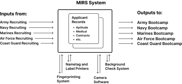
The application is used to screen and enlist hundreds of thousands of personnel every year. The platform is used to track medical records, aptitude tests, job selections, contract signatures, and other sensitive information regarding each incoming applicant.
I led the team through continuous discover, requirements gathering, content creation, and agile delivery phases of this project.
Project Team
My role: Design & Research Lead
2-4 Designers 6-18+ Engineers 1 Business Analyst 1 Account Manager
Our entire product team -- designers and engineers -- functioned as the research team during our initial Immersive Learning Phases.
Background
We were challenged with redesigning a complex legacy application. The MIRS system is used at 65 locations (MEPS) that process applicants who are enrolling in the US military across all branches of service.
Also...there’s a lot of acronyms. Here’s three that might help:
MIRS: Software
MEPS: Place
MEPCOM: People (the client)
(MEPCOM manages MEPS which run MIRS)
Background
The legacy system we were replacing was decades old. There were critical features missing, and the inflexibility of the software led to users creating clunky workarounds, like supplementing applicant information with post-its, emails, and in a few cases, different colors of highlighter.
One of the biggest challenges was determining what was actually necessary for the workflow, and what was an outcome of legacy application limitations.
There was a lot of resistance to modernization — previous attempts to redesign the system had failed, and users were skeptical of our efforts.
We were able to get user buy-in by creating a culture of co-creation. We worked very closely with stakeholders and users to align expectation and socialize process changes.
As part of our project kickoff, we had our stakeholders spell out an applicant’s journey -- all the steps an applicant would take, from their first visit to the MEPS to their ship date to boot camp.
Most of our stakeholders -- subject matter experts across the various silos in MEPCOM -- hadn’t ever seen the process spelled out this way, and many didn’t quite realize how complex it was and the ways that their workflows interacted until they saw that this “happy path” ended up taking both sides of a whiteboard!
This whiteboard ended up living full time in our working space for 23 months, until we tried to erase it in March 2020. The marker was basically stuck on there, which is probably a good metaphor for how imprinted into our brains this workflow became. :-)
Ethonographic Research & Immersive Learning
We shadowed MEPS staff to understand their daily routines, what worked well, and where they struggled. We watched as they used legacy software, taking notes of shortcuts and hacks they used to get their job done.
Understanding the user journey was critical to designing a solution that met regulations and was easy to use. In the existing process, the applicant experience was very transactional. Knowing this was a very important step in their lives, we shought out to create a workflow that put the applicant at the center of the process. We designed a solution that was much more human-centered and accessible.